SafeTogether
Presentation file
SafeTogether - An application to inform, prevent, protect and care people about the natural disasters in French Antilles


SafeTogether - An application to inform, prevent, protect and care people about the natural disasters in French Antilles
The name Safe Together is clear and direct, noting how the app bands people together in safety against potential natural disasters. We wanted to focus on a sense of community and link amongst the users, conveying this mainly through typography.
Our research shows that rubble is generally one of the biggest challenges, thus representing it with the word Safe, that was stopped with the “T” of Together’s crossbar. This in turn enables Together to represent a huddle, a sense of community.
The deep red colour is commonly used in safety and first aid, it was thus important to have it as a major component. Moreover, the lowercase “t” makes a cross, resembling the red cross and first aid. Thin outlines over each letter makes the overall logotype breathe. A small rounded square on the bottom right corner reminds of a full stop and helps balance the overall composition, giving way to the idea that Safe Together cannot be put into question.
As a secondary mark, the “S”, “T” and cross merge together as a pattern that can be used in many promotional materials and also look appropriate for the app icon. This mark can also be used in specific cases with the name written in Futura PT Heavy. Futura is a font that is relatively round, with its signature long apexes; breaking the symmetry all the while giving a professional and serious vibe mixed with relatability.
The corners are rounded as to give the eye a smoother feeling, sharp angles would be too aggressive and counterproductive to the project’s meaning.
You can find the different logo that we use :
 ,
, ,
, ,
,
We decided to use the Internet as an outlet channel for our project because, as already mentioned, we did not want to resort to charities that work on the field. We aimed for collaboration with said charities. Our project was to be based on their work, and thus contribute considerable to the associations and to the civil society. Furthermore, we are convinced that we can spread more information online and hence reach more people.
Our choice to create an application rather than a website was related to the sheer structure of the two formats and corresponded more to our vision and our ideas. Furthermore, an application interface is easier to browse and can be used everywhere by everyone.
The interface of an iPhone with our application 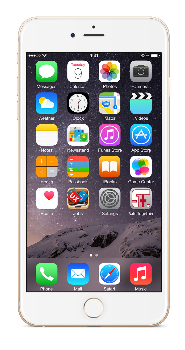 ,
,
In order to be properly aligned with its purpose and the intentions behind it, we decided that our application will be offered for free on the different download platforms : Apple’s App Store and the Google Play Store.
Our application will not be based on the principles of Freemium or In-App purchase. Users, who download the application for free, will have an unlimited access to the application’s functions and its data. They will not have to buy additional services in order to have full access to the application.
Our project should be directed to everyone who lived or who travel in this area. We don’t segment our proposition and our application in function of socio-demographic criteria, because we want to be useful for the majority and used by everyone.
Our goal is that everyone, no matter their age, job or level of education, can use our application.
The greatest weakness of our application is that people have to have a smartphone or a tablet to have access to the application.
In 2013, 26 % of Guadeloupians and 28 % of Martiniquais had a smartphone and 9 % of Guadeloupians and 7 % of Martiniquais had a tablet. No other official data is available for the French Antilles. Nonetheless, we can observe that the smartphone ownership rate of France rose to 39 % in 2013 to 65 % in 2016, increasing by 9 percentage points each year. If Guadeloupe and Martinique follow France, the smartphone ownership rate should amount to 53 % for Guadeloupe and to 55 % for Martinique in 2016.
Smartphones or tablets are more and more used by people to access online content. The number of websites accessed via smartphone increased by 49 % in Martinique from 2016 to 2017. But we observe that smartphone or tablet ownership has been correlated with the age, the job and the level of education of the population. In the entire French DOM-TOM (French oversea Departements and territories), we observe that the average smartphone users are young (age 15 to 35 years), well-educated (university degree) and with a high revenue (more than 3000€/month). An impressive 42 % of high socio-professional category people have a smartphone versus 21 % of employees and workers. Regarding the education, 43 % of people who have a university degree own a smartphone versus 33 % of people who possess a high school degree. This data analysis suggests that our aim of providing unlimited access to information no matter the location or data connection is not compatible under these circumstances.
Consequently, our application is the first to target users who live or travel in the French Antilles and who own a smartphone. This target group is young, well-educated and in a high socio-professional category. However we are not only focused on this base, because we observed that roughly about the half of the French Antilles population owns a smartphone and/or a tablet. This percentage increases steadily in every age, revenue and level of education category, which allows to release our application and its ideas worldwide.
The second issue that we identified is that not everyone is familiar with the interface an application, even if the user in question owns a smartphone or a tablet. This is why we intend to create an intuitive application with an easy navigation through the different parts of the application.